Tuesday, December 4, 2012

One Bedroom Residence and Common Area Design

Final Boards:
Final Model:


The song “Coming Home” by Gwyneth Paltrow brings to mind the growth and belonging experienced within the home. The encompassing feelings of warmth that envelope a home evoke playful curves and a sense of unity. The enlarging of elements through the space gives a sense of growth mimicking nature and its multitude of vegetation. Subtle curvilinear lines accent the repetitive unity, while stepped increase and decrease in size brings in the aspect of growth. Change in ceiling height as you enter the apartment and move deeper into the space evokes growth.  Repetitive elements are seen with the columns dividing the living and dining space as well as the tiling in the bathroom behind the vanity. Curvilinear shape comes in with the organic kitchen booth and shower design. To allow for the warmth home evokes, soft colors are chosen and daylight fills the apartment. Materials are chosen for their connection with nature both within the apartment and the common area. Growth is seen in the common area with decreasing sizes of furniture as you move back into the space as well as repetitive lines are seen in the ceiling lighting. 

The concept statement above applies to the common area and one bedroom apartment of the 2nd story to a hotel being re-purposed. I like the organic shape of the shower and its incorporation into the curvilinear aspect of my concept, as well as the curvilinear shape of the breakfast bar/booth and the ceiling curve in the kitchen. The repetition comes through with the tile behind the lavatory as well as the columns that divide the living area and kitchen. The idea of growth in the design is shown with the change in ceiling height, decreasing as you move back into the one bedroom apartment, as well as in the cabinetry both in the kitchen and living area with decreasing size of cabinets. I wish I had made the bedroom a bit more accessible, but everything else throughout the apartment is accessible for a person with a disability. The floor plan is very open so there is easy access to move through the space. In my study model I am very pleased with the detail and rendering of the walls, but which I had conveyed the change in ceiling height a bit better. The final boards I feel are very well planned out, there is only one portion of my common area board that feels empty, but other than that I am pleased with how it turned out. The most trouble I had with this project was picking which angles of the apartment to display. I found a lot of things important to show but I had to pick only a few or I would have had many more than five boards. Overall I am pleased with the design I created and the presentation of that design.


Saturday, December 1, 2012

Client Brief


For the client brief we started out interviewing the owner of the building as a large group, each presenting our own questions and recording the answers. This really helped me get an idea of what he wanted for the building. I wish he had been a bit more clear of an idea, but at the same time the freedom was wonderful in order to come up with my own design. The client brief helped me organize all of the information he gave us and take out what I believed to be most important to the design. Then I was able to come up with a clear adjacency matrix and bubble diagram for the space. I wish we had been able to visit the site to get a better idea of where we were designing and the space we were given, but not seeing it in person helped to work on visualizing the space in the mind's eye.  I am happy with the turnout of my adjacency matrix and bubble diagram but which I had used more compatible colors to harmonize the diagrams. Overall I it was a great basis to start my design work in the building.

Monday, November 26, 2012

Residence Design Visit and Critique


While at home for Thanksgiving Break I was able to sit down with Kim Sparks, an Interior Designer in Bellevue, to discuss my final residence designs. I brought her a few floor plans, some concept sketches and the materials I envisioned in the space. She looked over my work as I explained it and gave me some really good feedback and some ideas of what to change. She told me that she like how I made my residence open and flowing and that the concept I had created was present but not overpowering in my designs. By meeting with someone to discuss the project outside of the studio, it gave me a new pair of eyes and some new insights I probably would not have heard from my peers. It really helped to talk to someone outside of studio and I would be interested in doing this for projects in the future.

Tuesday, October 23, 2012

2 Bedroom Apartment Bathroom Design


The song “Coming Home” by Gwyneth Paltrow brings to mind the growth and belonging experienced within the home. The encompassing feelings of warmth that envelope a home evoke playful curves and a sense of unity. The enlarging of elements through the space gives a sense of growth mimicking nature and its multitude of vegetation. Subtle curvilinear lines accent the repetitive unity, while stepped increase and decrease in size brings in the aspect of growth. The tiling on the wall behind the lavatory evokes the growth with their change in size and vertical repetitive nature. Curvilinear shape comes in with the organic shower design and openness. Materials are chosen for their connection with nature and the counter marble resembles forestry. To allow for the warmth home evokes, soft gold tiling surrounds the shower and warm lighting fills the space.

Above is the concept statement with application into this two bedroom apartment bathroom. The design is supposed to related to the idea of home. I like the organic shape of the shower and its incorporation into the curvilinear aspect of my concept. The repetition of line from my concept really comes into play with the tile behind the lavatory. I also like the privacy created by placing the toilet back in the nook. I wish I had made the sink counter a bit larger but I feel it works for the space. In my study model I am very pleased with the detail and final construction, but which I had drawn in all of the walls instead of just a few. The final board, however, seems very empty in certain areas even if my pieces are gridded and organized according to sections. I am pleased with how my perspectives turned out, but the color does not come through enough on trace paper, so for the next design I will try using marker paper instead. Overall I am pleased with the design I created and find it is very open. Although the shower does not have a bench in it, the rest of the bathroom is ADA.

Sunday, October 7, 2012

2 Bedroom Apartment Kitchen Design


The idea of home brings to mind the growth and belonging experienced there. The encompassing feelings that envelope a home evoke playful curves and a sense of unity. The enlarging of elements through the space gives a sense of growth mimicking nature and its multitude of vegetation. Subtle curvilinear lines accent the repetitive unity, while stepped increase and decrease in size brings in the aspect of growth. Cabinets evoke the growth with their change in size and repetitive nature, while elements are further integrated through molding and accentuating materials. Flooring and cabinets are chosen for their resemblance of the forestry that is unique yet unifying in the world. To allow for warmth to infiltrate the space a window is placed on the far wall to let the sun stream through from the skylight creating the comforting feeling that nurtures the growth within the home. 

Above is the concept statement with application into this two bedroom apartment kitchen. The design is supposed to related to the idea of home. The warmth of the space really invokes this idea to me and I like how it is incorporated into this space. The appliances and fixtures chosen although sleek in design are also some of the most efficient models on the market which help the client strive for a more sustainable space. I wish I had placed the stove in a different location due to the vent blocking some of the light from the window but it was a sacrifice to be able to include double wall ovens in the space. In my study model I am very pleased with the detail and final construction. I find although the lines are freehand, it is crisp and clean in appearance. The final board, however, may be a bit crammed and I need to spread out the designs into a few boards next time. I am pleased with how my perspectives turned out, but my rendering skills of materials needs to be worked on. The end result of the resin material is well done but my rendered hardwood flooring needs to be developed.

Olympic Sculpture Garden Sketch Crawl


When touring at the sculpture garden I was able to look over the shoulder of some of the other urban sketchers. It was quite astounding to see them work and what they could do with their media. Just watching Ching sketch gave me hope to get better at sketching. I sketched a different angle than him of "The Eagle" but he found this perfect view that framed the space needle and I later wished I had tried that viewpoint. In my sketch I found I had thought the sculpture was proportioned correctly until I tried to fill in the buildings in the background. I would also like to improve my portrayal of shrubbery and trees. I am very happy with how the color of the sculpture turned out, but I should work into the shading a bit more. Even though I know a few things I would like to fix in future sketching, I am happy with how overall these two sketches turned out.

Saturday, October 6, 2012

Gensler Job Shadow

During the study tour I had a chance to go to Gensler for a job shadow and found it an insightful experience into a more commercial aspect of design. At the start of the day I spoke with Bruce, who is their main sustainability person and was able to learn about how the building they are located in is sustainable. I then  learned about a few different projects they were working on and was able to sit in on material and lighting meetings. During lunch I was able to sit down with a Senior Associate, Susana, and discuss what skills firms are looking for in a designer. She told me that computer skills are important but hand drafting skills are a constant necessity in design. To be able to communicate ideas quickly is extremely important in the business. I was also able to show my online portfolio and explain some of the previous projects I have completed. Susana told me that in the preliminary vetting an online portfolio is what they look at mainly, but once it comes to one-on-one meetings physical items to showcase are important too. In the end it was a wonderful time spent in their firm, seeing what kinds of things they do day-to-day. After my time there I find I am very interested in working there once I graduate.

Showrooms and the House of the Immediate Future

While out on tour visiting different showrooms, I learned the difference between their products and ones you could buy at department stores, in terms of quality and price. At the Knoll showroom it was a rushed visit but after seeing the space we had the chance to do one sketch. I chose this view from a seated area to the office cubicles behind it. The dividers allowed for privacy but you could also communicate well with some seated in the space. I wish I had more time to have completed this sketch and been able work into it with more depth, but am pleased with how it turned out given the short period of time.
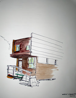
At the Habitat for Humanity "House of the Immediate Future" there was a guided tour through the downstairs of the home. I learned about the different components and had my first introduction to the idea of a wet core, housing everything water/wet related. I wish I could have seen the upstairs and how the wet core was laid out up there but found it very interesting to see the layout in such a small home. I found that the wall kitchen was an easy way to reduce space and open up the "living room". Before and after the tour I was able to create the sketch above. I was using a new watercolor kit and was having difficulty being able to clean out the brush between colors but I found I achieved the correct colors for the front facade of the home. I wish I had worked in some more shading in the end but some of that comes through with the watercolor.

Thursday, September 20, 2012

Accessibility Sketch

                                                                   View from wheelchair
                        View from wheelchair of sink area
  
                        View from wheelchair at the coffee cart
 

When participating in this exercise, everything seemed very large in comparison. Unless objects were lowered it was very hard to access them. In the bookshelves, I was able to reach to the 5th level but it was quite a stretch for me. Another observation I had was that everything seemed more cramped because it was difficult to maneuver around corners in the wheelchair. In the bathroom in Daggy, I had a very difficult time even getting into the stall, but there was no way to turn around. The sign outside the bathroom claimed it was handicap accessible but I found the only accessible part was the sink which was low enough that it was easy to use. Also when looking forward or up, I was not visible in the mirror. The most I could see were a few stray hairs sticking up off the top of my head. At the coffee cart where you made you order I could not see behind the counter and it was very difficult to reach up to put something like a card or cash up there. However, the pick up station was low enough that it was easy to roll up to and with the leg room underneath, this was even simpler. The door buttons helped to enter a interior but if there wasn't one available it was near to impossible to get into the space.

I now more than ever believe the designed environment should be accessible to everyone, regardless of cost. Most people towards the end of their life with develop a disability, whether it is becoming hard of hearing or becoming a wheelchair user. As you age things in life become more difficult and so designing so that anyone can access space is more important. When available, angled mirrors help wheelchair users to be able to see themselves and I found it hard to believe neither Carpenter nor Daggy Hall had them in their bathrooms. I do like the few sketches I did, but wish I had experienced more than the few places we covered. I found the pictures my partner and I took really showed the experience and one of the hardest parts of this sketching excursion was rolling up or down ramps. When rolling down a ramp you had to go carefully and slowly or it would hurt your hand when you tried to stop and when moving up the ramp your shoulders ached at the end. I hope soon every environment can become accessible to everyone.


Wednesday, September 19, 2012

Home Concept Development


Parti Sketch

 Above are the chosen thumbnails that I developed to embody the idea of home through the inspiration and ideas I found in the song "Coming Home" by Gwyneth Paltrow. I started by analyzing the song and finding what aspects I found most prominent. The most common ideas that I tried to base my thumbnail sketches on were the idea of home, belonging and growth through the home. I played with the idea of the home being a shelter but the ideas started being too literal in nature. The final parti sketch I decided to use to create a 3D concept is shown above. It shows how home is the center and where the heart is and belongs and how all paths take you home. I transformed this into a 3D design by extending the structure upwards and create dynamic changes in heights to show the growth but uneasiness a home can create. Things are not always steady and home so this is shown in the variable heights. The lines on some of the pieces show the unity and anomaly that can be found in a home and how everyone is different but still find ways that they connect. I use color to create anomaly in the 3D design in showing that some can be different but still belongs. The leaf shaped pieces are increasing in size which show the growth found in the home and the belonging it creates. I like the overall plan idea but wish I had found a way to extend and maybe create a standing structure through roots that connect the different pieces. I do also like the natural wood to be used that connects with the idea of the project. I found I was able to come up with many ideas but wish I could have abstracted them more to create more interesting ideas in the 3D form.

Thursday, August 30, 2012

Bathroom Design

The task for this project was to create a poster with a case study about a certain topic. We researched the topics in groups and our group's topic was bathroom design including universal design, so I chose the McCoy bathroom designed by Clint M Larkan and his associates. My specific items to cover in my group were the toilet features and ventilation in the space. I like the lines drawing you through the poster, but the font seems a bit out of place for the design. The picture layout works well with the text below, but I wish the text in the picture of the before and after plan had turned out clearer. We were able to brainstorm ideas for our specific topics together as a group and when we were stuck trying to figure out something we would get help and feedback from each other. I found our team collaboration went very well.

Wednesday, April 25, 2012

Sketchbook Cover and Reflection

 
Overall I feel my sketches have improved through the semester. This can be seen best through the fruit still lives. The first sketch is done in pencil and has some shading but the shading really develops in sketch 6. Texture is also added into that sketch where it was not used in the previous one. My perspective seems to have improved from sketch 3 to sketch 10, with more accurate lines. I feel I can develop it even more through practice. My composition is strongest in sketch 4 and 9 with the use of the entire page. I still need to keep working into the shading and use of color in my sketches. Some of my line work needs improvement, but I have improved my skill with using a pen in sketching throughout this process. The flair pen is definitely my favorite sketching utensil now.