

>> An inspired journey through design, travel and art <<
Thursday, August 30, 2012
Bathroom Design
Wednesday, April 25, 2012
Sketchbook Cover and Reflection


Overall I feel my sketches have improved through the
semester. This can be seen best through the fruit still lives. The first sketch
is done in pencil and has some shading but the shading really develops in
sketch 6. Texture is also added into that sketch where it was not used in the
previous one. My perspective seems to have improved from sketch 3 to sketch 10,
with more accurate lines. I feel I can develop it even more through practice. My
composition is strongest in sketch 4 and 9 with the use of the entire page. I
still need to keep working into the shading and use of color in my sketches. Some
of my line work needs improvement, but I have improved my skill with using a pen
in sketching throughout this process. The flair pen is definitely my favorite
sketching utensil now.
Monday, April 23, 2012
Process Poster

Monday, April 16, 2012
Resume

Monday, April 9, 2012
Logo Design


Wednesday, February 15, 2012
Weekly Sketches

Value of a room with normal lighting and bright high contrast shadows.
I like the great shadow that was cast at this hour but I wish I were able to capture the density of it better. I also wish I had drawn some of the elements more alike, for example the chair in the far back for both pictures are different slightly in angle.

The negative space of a chair captured through sketching.
I like the intricate detailing of the chairs back shown through this but wished I had picked a chair that did not have a blank white background. I feel it would have been more interesting with some figure-ground relationship shown.


A sketch of a sliding door handle using colored pencil on black paper.
The picture on the left is when I first went through with Crayola pencils and tried to capture the handle but I feel as though I did not get the depth properly. Then I went back through using Prismacolor pencils and was able to get more depth and make the color show up better on the paper as seen in the right picture. I like the one of the right a lot better but feel I could have capture the depth of the crack of the door better.


A figure trace of a little boy posing as superman.
I like how it turned out overall but wish I had added more line texture for the creases in the arms.
 | ||||
| A sketch of the cross-section of multiple oranges. I like the the composition on the cutting board but wished I had moved it up on the paper more or off set it some. |
 |
| A sketch with shading of a corner in my room. I like the depth of value in the corner by the sink but I wish I had darkened everything so it did not scan so lightly. |
 |
| Multiple views of a chair in my room seen from top, bottom, side, front and perspective. I like the composition of the chairs on the paper but which I had showed more texture. |
 |
| A perspective and floor plan view of my current dorm room. I liked how the floor plan and perspective are so close to each other, but I feel like my perspective is off. |
 |
| A Mind Map based off the first word that I thought of. I like the color I added into it but I wish I had filled up more of the empty space. |
Roman Textile Design

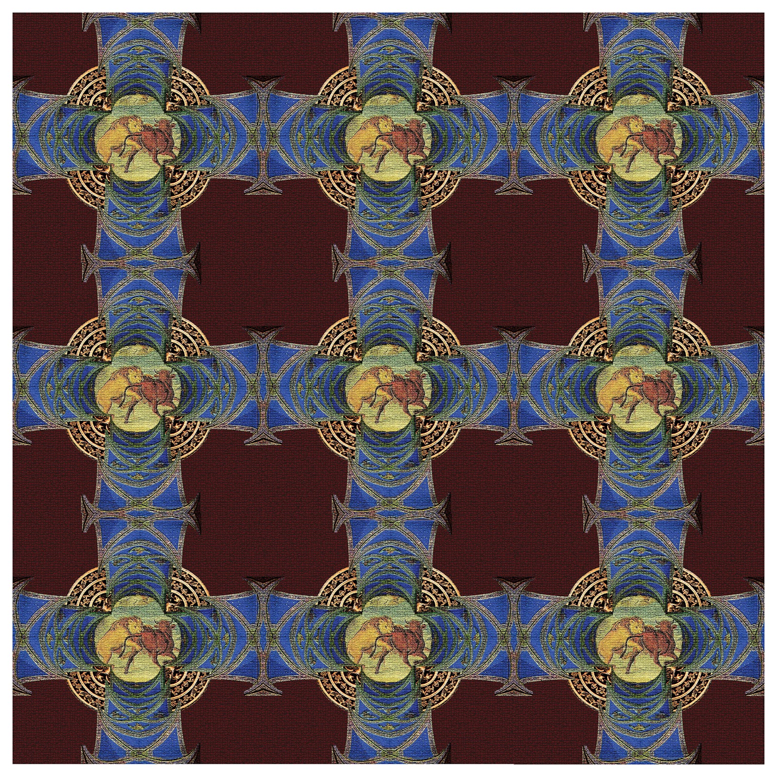
For this Design I continued using the Roman influence with a few new images. In Roman culture, gladiator
fighting was a focal point of their lifestyle and is interpreted by the lion
attacking the bull. The curvature work
in the groin vault and the arch are seen in most of their buildings and were
used to focus and draw the eye to the
central piece. The colors of red and blue were seen as royal in Roman history
and gold was associated with money and power. The textile design incorporates
all of these essential qualities of Roman history by using them to center in
and create harmony in the piece. The texture was chosen from their frequent use
of mosaics in their lavish homes and creates an interesting contrast for the
eye.
Although the contrast between the blue and red are nice I find the center image is not as harmonious as I wished. But I do like how everything lined up in the final 30x30 textile.
Although the contrast between the blue and red are nice I find the center image is not as harmonious as I wished. But I do like how everything lined up in the final 30x30 textile.
Subscribe to:
Comments (Atom)